Team Schedule Sparklines on Team Pages
Posted by Sean Forman on April 11, 2011
2002 Oakland Athletics Batting, Pitching, & Fielding Statistics - Baseball-Reference.com.
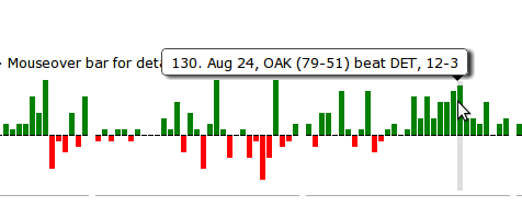
If you look above the team batting stats you will now see a graphical summary of the team's season. The height of the bar is equal to the margin of victory (up to ten runs). Losses are in red and wins are in green.
I've grouped the games by month. Double-headers are slightly narrowed since they occurred on the same day. Off days are included as blanks, and if you mouse over the bar you will see a summary of the game as shown below. Clicking on the bar will take you to the box score.
Currently this is updated back through 1985, but we'll have every team updated within an hour or so.


April 11th, 2011 at 11:03 am
That's excellent!
April 11th, 2011 at 12:03 pm
Great job!!! Really cool tool.
Baseball-reference strikes again!!!!
April 11th, 2011 at 12:22 pm
Very cool. If you could fit the "GB" column into the tooltip it would be even better.
April 11th, 2011 at 12:51 pm
Very cool. But, I'm a little bummed that there isn't a very long bar on August 22nd, here...
http://www.baseball-reference.com/teams/TEX/2007.shtml
🙂
April 11th, 2011 at 2:18 pm
for a 9-7 game?
April 11th, 2011 at 2:19 pm
🙂
April 11th, 2011 at 2:20 pm
For anyone who thinks Salty can't hit....check that line out :O
April 11th, 2011 at 2:33 pm
@4, @5
There were two games on Aug. 22. The Rangers won the first game by 30-3 and the second game by 9-7. The chart shows two narrow bars for that date indicating a double-header. The height for the first game isn't longer because all margins of victory greater than ten runs are equal in height to a ten run margin bar.
April 11th, 2011 at 2:38 pm
I like how Texas scored those 30 runs in only 4 seperate innings.
April 11th, 2011 at 5:35 pm
[...] Sean Forman introduces a new graphical addition to the site’s team pages. Link Posted on Monday, April 11th, 2011 at 5:33 pm, Category: Baseball, Tags: bref, cool-graphics, [...]
April 11th, 2011 at 5:48 pm
This is excellent! I'm curious as to what was used to create these. A JavaScript library?
April 11th, 2011 at 6:29 pm
As an A's fan, I very much approve of the example sparkline shown in the original post.
April 11th, 2011 at 7:40 pm
This is a wonderful feature, and your site is unquestionably the standard--no one else comes close!
One quibble though--the choice of red and green leaves millions of color-blind guys--like yours truly--somewhat out in the cold. I'd wager most of your users are men, as are almost all color-blind individuals,
April 12th, 2011 at 12:18 am
I had a ticket for that 30-3 game, more accurately, a rain check for that game. But I was only in town for the originally scheduled day, so I missed the game.
April 12th, 2011 at 1:12 pm
DJ, it is pure CSS.
http://www.alistapart.com/articles/accessibledatavisualization/
April 12th, 2011 at 1:18 pm
@9 - even better than that, how there was a "Save" given in the game as well...
April 12th, 2011 at 6:50 pm
I'm not really a fan of this, at least not where it is. The colours are kind of ugly and it's distracting when, for example, I'm looking for Eric Hinske's line in with the 2004 Blue Jays (in a giant page of black text) and there's a massive blotch of green and red lines above where my eyes want to look. It'd be a lot better it was tucked away somewhere (the schedule and results page would be perfect) or if there was a way to disable it.
Basically, when I go to a team's yearly page, I'm not really interested in their season's results on a game-by-game basis, I'm looking to compare players. Because of that, I find that this is a rare distracting feature on a site that's been remarkably clean and well-designed since it launched.
Sorry Sean.
April 14th, 2011 at 1:48 am
Great feature. A few little quibbles or suggestions.
Tough to see the spacing between months - maybe an ultra-thin vertical hairline would be a better way to separate months.
Like DavidRF @ 3, having GB in the mouse-over info would be a nice addition.
Like Zach @ 17, I think the Schedule and Results page would be a better and more natural place to put this.